
If you’ve ever seen a poster from the 1930s promoting one of America’s national parks, created at the behest of the Works Progress Administration, then you have a good idea of the kind of tourism-style posters the illustrator and graphic designer Steve Shanabruch has created for a number of Chicago neighborhoods and landmarks.
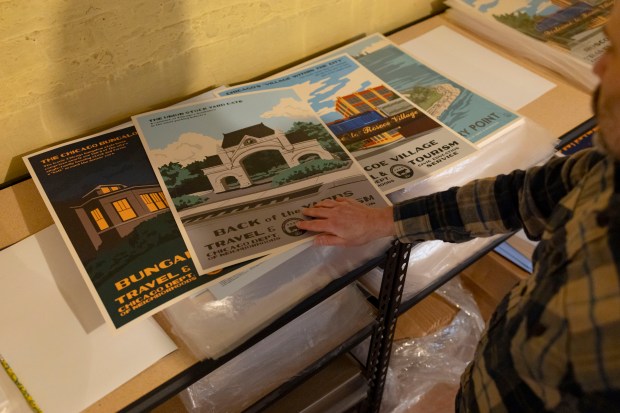
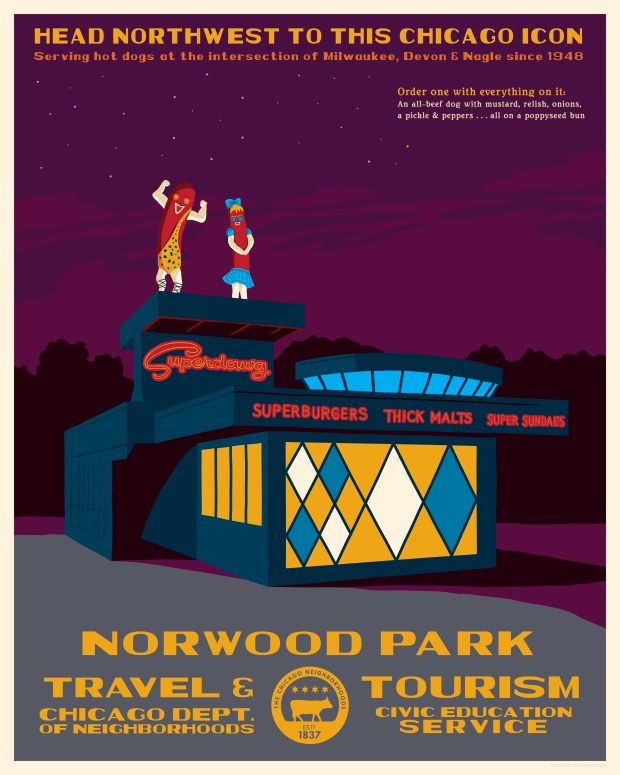
They are visually striking, with bold lines and vivid colors. The poster for Englewood features the sunny atrium of the yellow brick residential Yale Building. The poster for Norwood Park features the distinctive, colorful exterior of the Superdawg drive-in hot dog stand. His latest is a poster for Wicker Park featuring a Blue Line “L” train.
Shanabruch has no affiliation with any city agency. His impetus to draw these posters — which are available for sale on his website — is self-driven.
The project began 15 years ago with a simpler concept: Creating logos for Chicago neighborhoods.
“I hated my job,” says Shanabruch. “I was a designer with a sales company and I just wasn’t being challenged creatively. So it was just a personal project to fulfill my creative needs. I started the logos of neighborhoods and community areas in 2011.”
Shanabruch is originally from Chicago. He grew up in Beverly.
“Chicago and Chicago history is ingrained in my blood. My father started the Chicago Bungalow Association for the city and ran it from its infancy. So the city’s idiosyncrasies have always appealed to me. I think that’s probably true for any designer or creative person.”


He began by creating three logos a week.
“I used to wander a lot more before I had a child,” he says of his inspirations. The logos were “based on personal experience with those neighborhoods” and imagery that felt representative.
The Humboldt Park logo features the Puerto Rican flag arch on Division Street. The Hyde Park logo features the stained glass from Frank Lloyd Wright’s Robie House. The Kenwood logo has an Art Deco graphic from the Powhatan Apartment building. The New City logo (an area that encompasses Back of the Yards) features a pig, referencing the neighborhood’s history as the site of slaughterhouses. The logo for South Chicago features a car that looks like it’s speeding up a ramp, which is a reference to “The Blues Brothers” movie when the Bluesmobile jumps the partially raised 95th Street Bridge.
Occasionally, Shanabruch says, people would reach out about using the logos. “I was actually just driving through Bowmanville and saw it on a banner and I was like, oh man, I forgot that I said they could do that!”
After a year or so, he burned out on logos. That is what led him to the next iteration of the project with neighborhood posters. He owns a copy of one of those old WPA National Parks posters, and looking at it one day, he thought: That could be fun if I focus on various Chicago neighborhoods.
“Just based on doing the logos, it became obvious that people have so much pride in their neighborhoods,” he says. “And it’s a nice way to feature neighborhoods that don’t ever get featured. There’s a lot of Chicago art out there, but so much of it is based on downtown or the lakefront or any of the hip neighborhoods. But somebody in North Lawndale? They’re probably happy they live there and would appreciate seeing it represented on a poster. I’ve been selling these since 2012, so I know if a certain neighborhood poster is not going to sell. But I’ll still do it because one, it’s creatively fulfilling, and two, it’s really important for people to be seen. Every neighborhood is important, even if it gets dumped on by the media. And I want to create art that celebrates the city.”
These days, Shanabruch lives in Portage Park. And the Portage Theater is featured prominently in the posters. That feels intuitive. Some of the posters are more counterintuitive. Rogers Park, for example, features the Madonna Della Strada chapel on the campus of Loyola University.
“I’m not religious, I have no ties to Loyola. But I’m doing this mainly for creative fulfillment and I love Art Deco and wanted to draw that Art Deco church. But I’ve also learned that my posters featuring churches don’t sell well.”
What began as an informal side project now makes up half of Shanabruch’s income. In addition to his website, his art is sold around town, including the Willis Tower Skydeck gift shop. He quit his job more than a year ago and now also works with clients on a freelance basis. When Preservation Chicago released its list of endangered sites last week, Shanabruch was hired to draw a poster featuring a column from the Chicago Stock Exchange trading room floor, currently housed at the Art Institute.
He estimates that he’s done around 60 neighborhoods so far.
“I never plan it out. I do it on a whim,” he says. “But I really want to do Irving Park, because I get a ton of requests for that. But usually it’s because I’m driving through a neighborhood and I’ll be like, ‘Oh, man, I haven’t been here in a long time,’ and then I’ll start to notice things and usually that inspires me. It’s definitely serendipitous.”
He then draws the posters on an iPad. Some years, he’s released 10 or 11 prints. Sometimes it’s just five or six, “depending on my workload and what’s going on in my life.”
Shanabruch has also added a third element to the project: Fonts based on signage around town. The newest is inspired by the iconic Pride Cleaners building in the Chatham neighborhood, which recently announced that it is closing. All the fonts can be downloaded for free.

“From neon signs to letters sculpted into a building’s facade, Chicago has a long history of amazing signage,” he says on his website. “So many of these signs have been lost over the years, but I have found a way to preserve what we still have and commemorate what we have lost through an ever-expanding roster of signage-inspired fonts.”
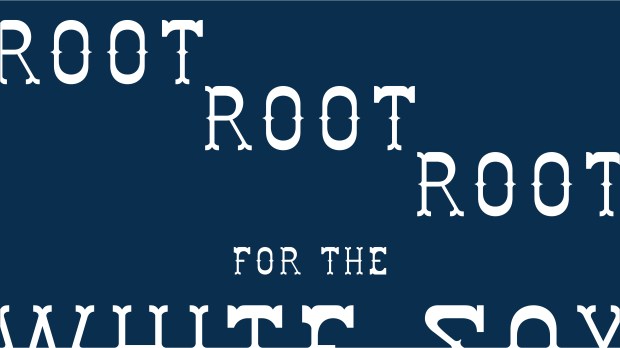
He calls one of the fonts Comiskey and it’s based on a photo of the ballpark stadium that he guesses is from the 1960s or ’70s. The letters have spurs on them, giving the font an almost country-western look. “The White Sox were quirky back then.” There’s another called Tap Room, based on the signage of the Lincoln Tap Room in Lakeview.
“I’m not a trained typographer, but the first one I did was Starsiak, which was on the Starsiak Clothing building on Milwaukee and Division and I just wanted to recreate that. So I made all 26 letters and 10 numbers and punctuation and then made a font file. And I was like, well, that was a fun challenge. So I just started making them, and then people started sending me pictures saying, ‘Hey, you should make a font of this one.’ Some of them are iconic signs, some of them aren’t.”
He says he finds himself working on fonts when he’s supposed to be focused on something else.
“I call it procrasti-working. I’m being productive, just not on the thing I’m supposed to be productive on.”
The fonts are free to download.
“I don’t care how people use them, as long as they’re not using them for Trump ads or ICE stuff. I guess I can’t control that, but that’s my preference. I was in Edgewater Candles the other day and they gave me a shirt of theirs because it had one of my fonts on it. It was awesome. And then I saw someone used one of my fonts for album artwork and I thought, hey, that’s cool. So it’s fun to see — that’s why I put them out there for free. The low self-esteem designer in me is like, nobody would pay for these, so I might as well just get them out there. I made them, so why not let people use them?”
By contrast, the prints on Shanabruch’s website are not free. But the price — $28 per poster — isn’t outlandish.
“That’s the thing, I want the posters to be accessible,” he says. “It’s nice because some people will leave Chicago and they’ll buy five or six of them to represent all the neighborhoods they’ve lived in so they can still have that memory.
“I mean, it’s exciting any time anyone says they like my art. Obviously, people buy it, but it’s still astounding to me that people like the stuff I make.”


